Google is continuously working on refining the experience with Google Maps, and this is good news on every possible level. Google Maps is used by millions of people every day, so every update should make using certain features easier.
The company's latest focus was on the home screen, as it wanted a fresh new look to simplify the UI and offer a cleaner UI.
However, I wouldn't be surprised if some users missed the redesign. Google focused exclusively on the crowded bar at the bottom, consolidating some options under a single roof.
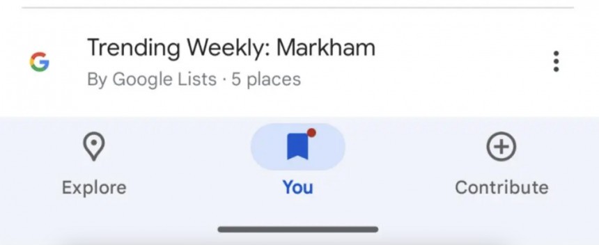
The current version of Google Maps for Android, which is still available for 99% of the users, comes with five options in the bottom bar, namely Explore, Go, Saved, Contribute, and Updates. The new version has only three options called Explore, You, and Contribute.
The design looks a bit odd, as the space left between the options at the bottom of the screen seems like a big waste. However, Google believes it's better this way, as the simplified look makes it easier for users to find the options they need.
The You section takes center stage, bringing the other options under the same roof. The Go tab, which offers one-tap access to previous trips, letting you start navigation faster, has moved under a section called Saved Trips under the You tab.
Google keeps refining the Google Maps interface, and the biggest update was released in late 2023 with the new color palette. The visual style was received with mixed reactions by Google Maps users, as most of them criticized the updated look due to colors that made certain information, such as the active route, more difficult to track on the map. Google never made a public announcement about the redesign but slowly enabled the new interface for everybody, regardless of the platform.
Users worldwide have seemingly gotten used to the new interface so that Google can focus on other improvements in Google Maps.
The application is also evolving on other platforms, including in the car. Google Maps for Android Automotive is getting an option to show nearby charging stations automatically when the battery runs low on battery. Thanks to Android Auto integration into the vehicle, Google Maps can read battery information, offering charging suggestions during a trip. The new feature allows the app to monitor the battery level and, when it drops below a certain threshold, to search for compatible stations nearby and offer directions to the closest.
The redesigned home screen is currently exclusive to Android, but Google seems to stick with a server-controlled rollout. The search giant will eventually enable the new interface for everybody in the coming weeks, but for now, installing the latest app update doesn't seem to produce any visual change for the bottom bar.
However, I wouldn't be surprised if some users missed the redesign. Google focused exclusively on the crowded bar at the bottom, consolidating some options under a single roof.
The current version of Google Maps for Android, which is still available for 99% of the users, comes with five options in the bottom bar, namely Explore, Go, Saved, Contribute, and Updates. The new version has only three options called Explore, You, and Contribute.
The design looks a bit odd, as the space left between the options at the bottom of the screen seems like a big waste. However, Google believes it's better this way, as the simplified look makes it easier for users to find the options they need.
The You section takes center stage, bringing the other options under the same roof. The Go tab, which offers one-tap access to previous trips, letting you start navigation faster, has moved under a section called Saved Trips under the You tab.
Users worldwide have seemingly gotten used to the new interface so that Google can focus on other improvements in Google Maps.
The application is also evolving on other platforms, including in the car. Google Maps for Android Automotive is getting an option to show nearby charging stations automatically when the battery runs low on battery. Thanks to Android Auto integration into the vehicle, Google Maps can read battery information, offering charging suggestions during a trip. The new feature allows the app to monitor the battery level and, when it drops below a certain threshold, to search for compatible stations nearby and offer directions to the closest.
The redesigned home screen is currently exclusive to Android, but Google seems to stick with a server-controlled rollout. The search giant will eventually enable the new interface for everybody in the coming weeks, but for now, installing the latest app update doesn't seem to produce any visual change for the bottom bar.


