Say what you want about Android Auto bugs, but some are so ridiculous that not even Google can determine why they happen.
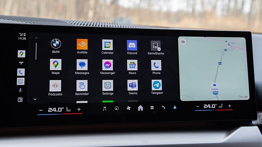
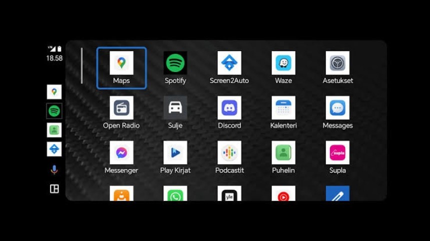
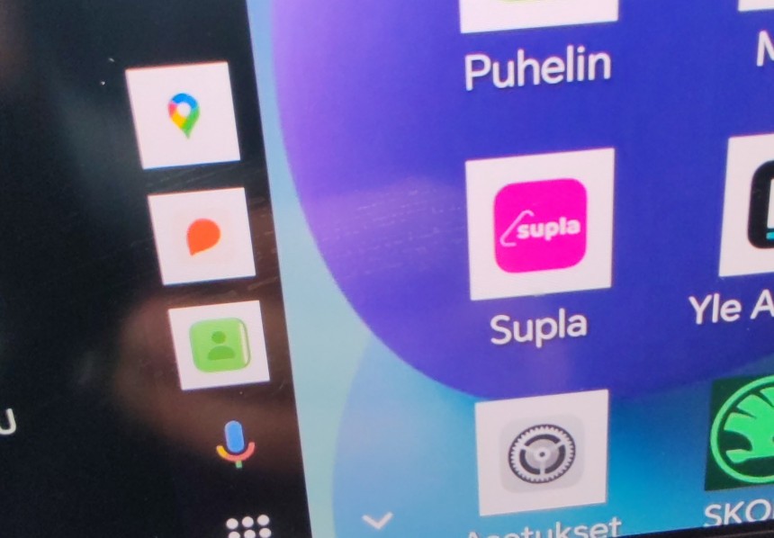
A recent glitch impacting what is still limited a number of users causes the app icons to become square with a white background, making the home screen look like one of the first mobile phones with a color screen.
The odd design was first reported in early June, but I saw sporadic complaints about this issue in April, so some users noticed it earlier.
The first post on Google's community forums is dated June 20, with someone complaining that the icon design was changed "after some update." It's unclear what update triggered the new design, but I doubt a new Android Auto version was responsible. Google typically rolls out such changes with a server-side switch, and the so-called "yucky icons" will likely align with the same model.
While everybody seems confused about why the icons have changed to this outdated design, a Community Specialist who claims to be part of the Android Auto team says users must provide more feedback on the issue via email.
I asked around, and here's what I found.
First, it's important to know this is not entirely a bug. Google hasn't yet started an investigation because the reported icon design hasn't been flagged as a bug. However, the Android Auto team spotted the reports, and it's believed that the white background is triggered by a glitch in how another feature was integrated into Android Auto. It could also result from a software error in certain custom Android ROMs installed by various OEMs on their Android devices.
Google announced earlier this year that Android Auto app icons would start using the same design as on mobile devices on Samsung phones. The feature landed in an attempt to create more consistency between phones and the Android Auto screen.
With this update, the search giant essentially dropped the default Android Auto app icon design for the one available on mobile devices and implemented by the Android device maker. The rounded icons on Samsung phones appeared on Android Auto shortly after the announcement, and despite not everybody liking it, the feature was an efficient way to create more consistency in the Android ecosystem.
Google also announced support for phone wallpapers on Android Auto as part of the same effort. This allows users to enable the same backgrounds in the car as on their smartphones. Both features support Samsung phones.
The Mountain View-based search giant has been working on expanding these two features to more devices. A Google engineer told me that the white backgrounds could be the result of this "experiment" to bring the phone icon design to Android Auto on more models. However, it's unclear why this test landed in the production builds and didn't remain exclusive to testing updates shipped to beta testers.
However, this scenario makes sense.
Google doesn't want to keep the consistency between mobile phones and Android Auto exclusive to Samsung devices, so the company has already started testing an expansion to more brands. I've seen people claiming that the issues happen mainly on mobile devices from Chinese brands, and while I can't confirm this, it could explain why the problems appear only on phones that aren't officially supported.
Is there anything you can do to return to the original icon design?
Not really, as without Google understanding precisely what happens, it's impossible to find a way to get rid of the square boxes on Android Auto. I'm being told that Google pondered adding a switch to let users toggle between the default look and the icon design on the mobile device.
In the long term, the search giant could aim for something that CarPlay users can only dream about: introducing support for third-party icon themes.
The feature is already available on mobile devices, as Android phone owners can customize the look of their home screens and app drawers with various icon designs. With this synchronization feature, the company could try to expand it to the car. The end goal is the same: create more consistency in the Android ecosystem and make it clearer that Android Auto is part of this offering.
Google is working on multiple fronts to make this happen, including integrating the vehicle radio into the Android Auto experience. The work on this feature is already underway, but it's unclear how Google wants to make it happen, especially as the company wants a full UI to let users listen to a specific radio station without forcing users to leave Android Auto. The most convenient way is to add an Android Auto shortcut to connect to the car's radio menu, which implies that users leave Google's application and return to the native software installed in the vehicle.
Google has yet to announce the development of Android Auto car radio support.
The odd design was first reported in early June, but I saw sporadic complaints about this issue in April, so some users noticed it earlier.
The first post on Google's community forums is dated June 20, with someone complaining that the icon design was changed "after some update." It's unclear what update triggered the new design, but I doubt a new Android Auto version was responsible. Google typically rolls out such changes with a server-side switch, and the so-called "yucky icons" will likely align with the same model.
While everybody seems confused about why the icons have changed to this outdated design, a Community Specialist who claims to be part of the Android Auto team says users must provide more feedback on the issue via email.
I asked around, and here's what I found.
Google announced earlier this year that Android Auto app icons would start using the same design as on mobile devices on Samsung phones. The feature landed in an attempt to create more consistency between phones and the Android Auto screen.
With this update, the search giant essentially dropped the default Android Auto app icon design for the one available on mobile devices and implemented by the Android device maker. The rounded icons on Samsung phones appeared on Android Auto shortly after the announcement, and despite not everybody liking it, the feature was an efficient way to create more consistency in the Android ecosystem.
The Mountain View-based search giant has been working on expanding these two features to more devices. A Google engineer told me that the white backgrounds could be the result of this "experiment" to bring the phone icon design to Android Auto on more models. However, it's unclear why this test landed in the production builds and didn't remain exclusive to testing updates shipped to beta testers.
However, this scenario makes sense.
Google doesn't want to keep the consistency between mobile phones and Android Auto exclusive to Samsung devices, so the company has already started testing an expansion to more brands. I've seen people claiming that the issues happen mainly on mobile devices from Chinese brands, and while I can't confirm this, it could explain why the problems appear only on phones that aren't officially supported.
Not really, as without Google understanding precisely what happens, it's impossible to find a way to get rid of the square boxes on Android Auto. I'm being told that Google pondered adding a switch to let users toggle between the default look and the icon design on the mobile device.
In the long term, the search giant could aim for something that CarPlay users can only dream about: introducing support for third-party icon themes.
The feature is already available on mobile devices, as Android phone owners can customize the look of their home screens and app drawers with various icon designs. With this synchronization feature, the company could try to expand it to the car. The end goal is the same: create more consistency in the Android ecosystem and make it clearer that Android Auto is part of this offering.
Google is working on multiple fronts to make this happen, including integrating the vehicle radio into the Android Auto experience. The work on this feature is already underway, but it's unclear how Google wants to make it happen, especially as the company wants a full UI to let users listen to a specific radio station without forcing users to leave Android Auto. The most convenient way is to add an Android Auto shortcut to connect to the car's radio menu, which implies that users leave Google's application and return to the native software installed in the vehicle.
Google has yet to announce the development of Android Auto car radio support.


