Apple has embarked on an ambitious mission to turn Apple Maps into the best navigation app worldwide, and while the company makes slow progress and rarely releases big updates, it sometimes comes up with questionable changes that don't make much sense.
One such example is a recent update that was included in iOS 18 beta 2 for developers.
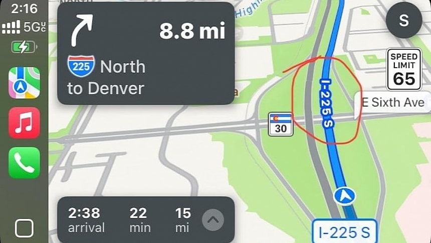
Apple has tried to simplify the Apple Maps UI on CarPlay by tweaking how highway names are displayed on the maps.
Instead of highway shields, Apple Maps now shows the names on the highways themselves, so they are displayed sideways with a white font on a blue background (when navigation is enabled in the daytime mode).
Reading the text is not as easy as you'd think it is. Drivers are tempted to turn their heads sideways to read the highway name, and you can imagine how dangerous this can be, especially because the car is supposed to be in motion when they do this.
CarPlay and Apple Maps are both meant to make driving safer and less distracting, and this change does exactly the opposite. The highway shields were more convenient and straightforward for drivers, albeit they didn't make the maps as clean as the names added directly to the highway.
It's unclear if this is an experiment or if Apple plans to stick with this change, as the company didn't announce it, but we should determine the long-term strategy by September when the work on iOS 18 is projected to be finalized. The next iPhone update is due in the fall, so the current builds available for download are only supposed to be used for testing. This is why the likelihood of this change being just an experiment is high, but without an announcement, it's hard to tell if Apple is committed to retaining it in production builds.
The screenshot shared on reedit by someone who installed the latest iOS 18 developer beta build also shows the new home button on CarPlay. Apple gave up on the familiar icon in the lower left corner, which allows users to launch the Dashboard and access the app drawer, adopting a new design that resembles the old-school home button on the older iPhones
The new button looks cleaner and somewhat familiar to long-time Apple users, but it replaces a design that CarPlay users have already become accustomed to.
Apple keeps refining CarPlay with these small changes, but its lack of transparency causes confusion, as it's unclear if these tweaks will stick around in the stable builds. However, this is the purpose of a beta program. Apple can experiment with various ideas, and if the feedback is positive and everything works as expected, the company can decide whether to introduce a new feature for all users.


