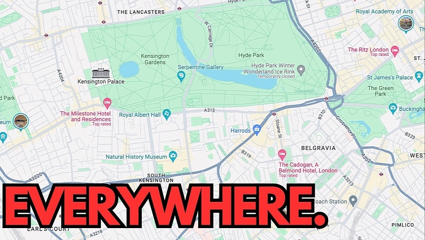
While Google has released several big Google Maps updates in the last few updates, such as the support for eco-friendly routes, one of the changes that received amazing press coverage was the refreshed color palette that landed in late 2023.
The search giant never announced the new Google Maps colors and briefly mentioned them in a blog post. However, users hated them from the moment they appeared on their devices for the first time. Many rushed to the Google Play Store to blast Google for the new visual style and post low ratings that eventually impacted Google Maps' score on the app store.
Google remained tight-lipped and never responded to the criticism, eventually enabling the new colors for everybody.
Now, the search giant is getting ready for the next phase of the rollout.
The Google Maps Platform, which provides developers with the necessary tools, resources, and APIs to integrate Google Maps into their apps, is getting the new colors that are already available on Android and iPhone. This means that apps with integrated maps powered by Google Maps will adopt the new theme.
Google says all updates will be automatically updated to the new colors by March 2025, but the good news is that developers can opt-out and stick with a custom or the old visual style in Google Maps. However, I wouldn't be surprised to see the search giant eventually enforcing the new colors for everybody, especially as the visual style helps brand recognition and makes it obvious that an app uses Google Maps.
The new Google Maps colors have been controversial mainly because they impact readability by making certain UI elements, such as roads, more difficult to observe. Google Maps is an application that should be used while driving, so users must be able to view critical information with a glance at the screen. The updated color palette defeats this purpose, sometimes making it more difficult to follow a suggested route, especially when the dark mode is enabled.
The new colors are also available in the car on Android Auto and CarPlay, as the experience is powered by Google Maps running on the mobile device. Once all apps are migrated to the new visual style, the new colors should become available everywhere, regardless of the app you use (unless the developer chooses a custom mode), both on your phone and in your car.
What do you think about the new Google Maps colors that are already available on your mobile device? Most people have already gotten used to them, as they've been around for more than half a year. So, do you still think that Google should undo the change and restore the previous theme? Let me know what you think in the comment box after the jump.


